Or, "How did you make that cool bar on the first page?"
The background is not very difficult at all. I opened up a new 16 million-color image with a white background. Since it was going to be a header bar, I made it 650 pixels wide and 150 pixels high. I took the airbrush tool and painted some thick lines in red, blue and green. Since we will be "waxing" this, make sure you use light colors. You may leave some small white areas when you paint, but do touch the corners and the edges (I have problems with this sometimes!). As you can see, these lines are not opaque.

Then I applied a Motion Blur to the image two times. In this example I had the blur direction set at 114 degrees and intensity set all the way up to 40 pixels.

MAKE SURE your Foreground Color is set to white and then apply the Hot Wax Coating.
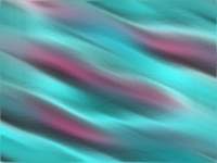
Your image should look like colored mist of smoke, or even silk-like! If you didn't smooth out your lines or you had a lot of white spaces, they will really stand out now (NOT what I'm after here!). If you like what you see, go ahead and save the image. But as for me, I'll be applying that Motion Blur again…. Okay, I did save a copy before I "blew" on it again! It was just too pretty!

And another dose of Hot Wax!

And there is a background similar to the bar I have on my first PSP page!
How much would you pay for a cool tip like this? Doooon't answer! Because you also get this amazing tip that'll make your life even easier!
Imagine that you're making buttons and bars and stuff. You've spent minutes or even hours getting that background or texture just the way you wanted! And now you've gotta junk it all because your text didn't come out like you'd wanted it to! Or maybe you forgot the drop shadow and you don't have your text selection saved so you can't fix it! Been there, done that, got the t-shirt, and wore it out washing the car! Here's an obvious solution:
It only makes good sense to save your background plain with no text, and to write your stuff "off-canvas" ! Open another image either the same size as your background/planned image or smaller. Choose a basic background color like white or black, depending on your text color. This way, you can experiment with font sizes and positioning your text until you get it just right without spoiling anything.
When you've got your text the way you want it go to the Selections Menu and Select All. Then go back to the Selections Menu and go to Modify. From the sub-menu that shoots out, pick Transparent Color and pick the background color your text is on. Voila! You've just selected your text! Now you're ready to Copy your text, then Paste it as a New Selection your background image! Or if you wish, you can work on your text even further (chiseling, waxing, applying filters, etc.), and then Copy and Paste. Whatever you need to do!

Now you're ready to put drop shadows to your text, and then finishing touches like beveling or Buttonizing.

And speaking of buttonizing………